Get Found. Get Clicked. Get Clients.
Web design, SEO, and Google Ads for local businesses in the East Bay.
★★★★★
5.0
· Google Reviews
Selected
Projects
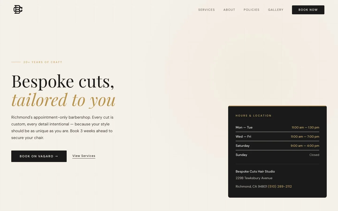
Bespoke Cuts Hair Studio
From zero web presence to page one on Google in two weeks.
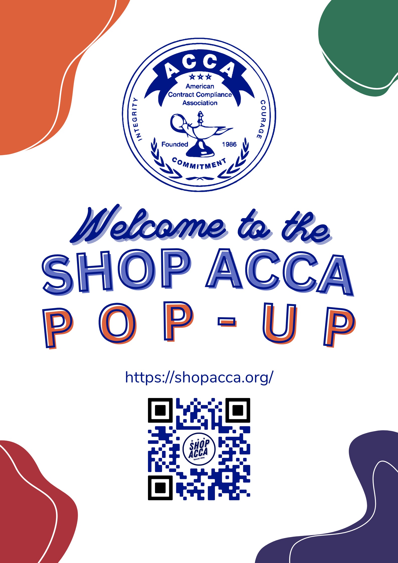
ACCA x Recess U Pop-Up
Brand vectorization, event collateral, and merchandise for a legacy nonprofit.
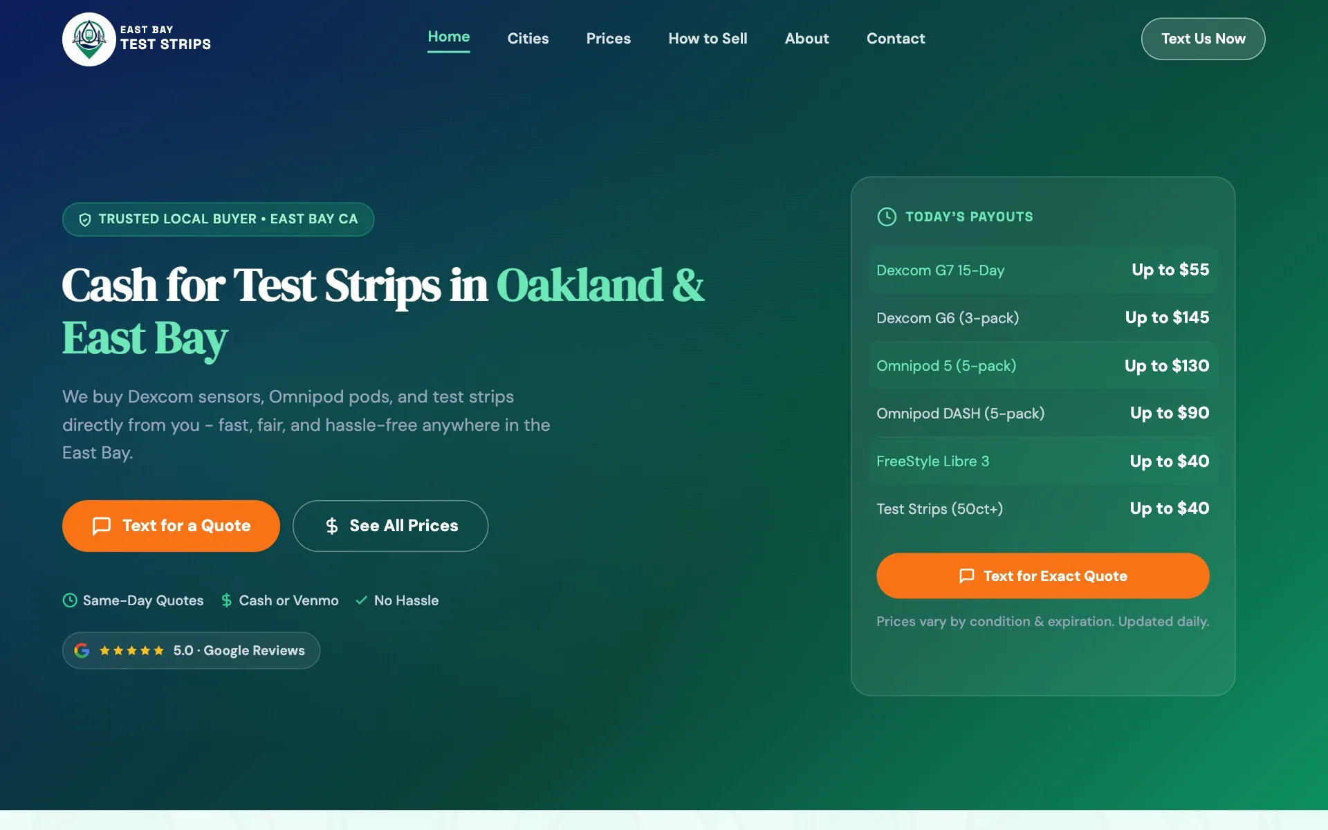
East Bay Test Strips
Conversion-first site with local SEO that drives same-day leads from organic search.
Services
Web Design
Conversion-first sites built to rank in local search and turn visitors into customers before they bounce.
SEO
Rank for the searches that drive real foot traffic and phone calls. On-page, technical, and local SEO.
Google Ads
Paid campaigns that generate leads from day one while your SEO builds in the background.